Portfolio.Logos
-
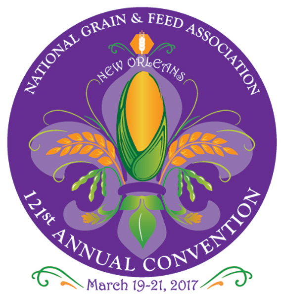
NGFA 2017 Annual Convention Logo
The National Grain and Feed Association wanted a logo for their annual convention being held in New Orleans that would incorporate recognizable NOLA symbols and traditional colors. The final design uses various grains to depict a fleur-de-lis. The package included header graphics for letterhead or other rectangular shape uses and social media assets for Twitter and LinkedIn.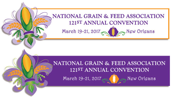
-

Feed & Pet Food Joint Conference Logo
The Pet Food Institute and National Grain and Feed Association hold an annual joint conference to explore regulatory, customer, and market issues that impact both the animal feed and pet food industries. The conference brand identity needed to convey togetherness of the feed and food industries with graphic elements to combine images of grains and a pet food bowl.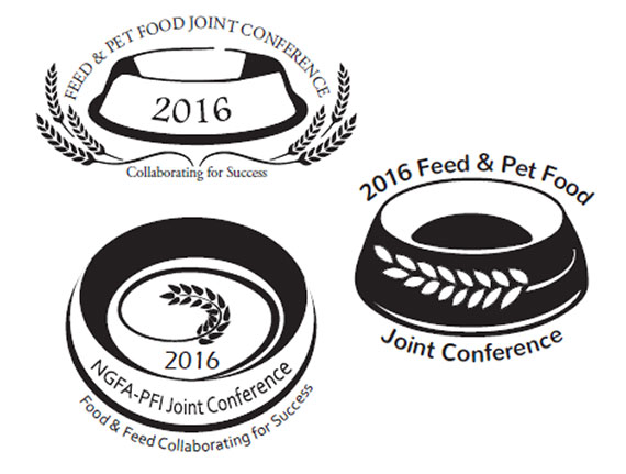
-
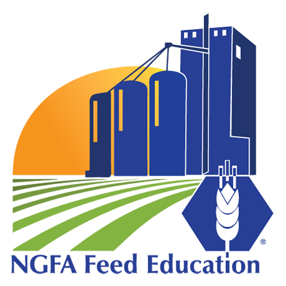
NGFA Feed Education Logo
The National Grain and Feed Association needed a logo for their feed education efforts. Requirements included incorporating a modern feed mill and the NGFA logo. Simplifying the very complex lines of a modern feed mill so it could be identifiable at the size of a postage stamp was a challenge. Mill style exploration was an important part of the project.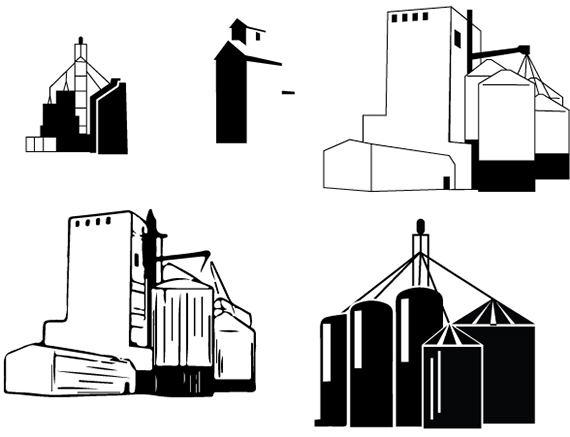
-
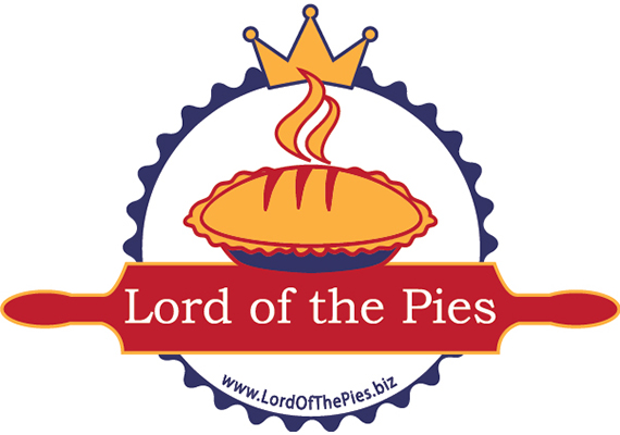
Lord of the Pies Logo
Pie and pastry chef, David Knowles, asked me to develop a logo to help build brand identity for his business Lord of the Pies. The final logo design incorporates visual images that speak to the fresh-baked taste including a pie with steam rising and a rolling pin. The scalloped edge represents the edge of a pie as well as a seal of approval and the crown indicates superior craftsmanship fit for royalty. Elements of the logo are used on the back of business cards.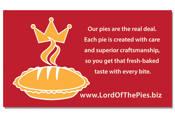
-
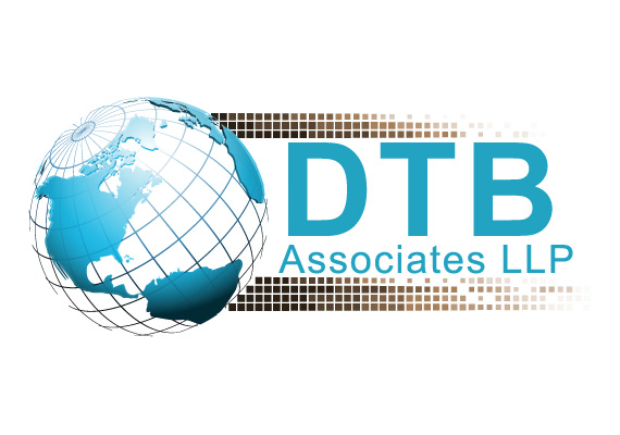
DTB Associates Logo
I created this logo for DTB Associates as part of their website redesign. DTB is a consulting firm specializing in international trade, so the globe was a natural choice for imagery. The multi-layered globe adds graphical dimension and the color palate works well on light or dark backgrounds. An early concept in the development phase is shown below.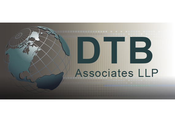
-
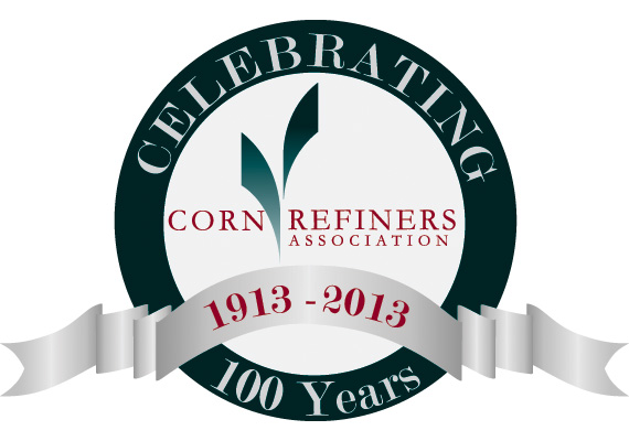
CRA 100th Anniversary Logo
The Corn Refiners Association asked me to develop a special version of the organization's logo to help celebrate it's 100th anniversary. A classic look keeping the brand identity strong made the final cut. I presented three versions. The runner up is shown below.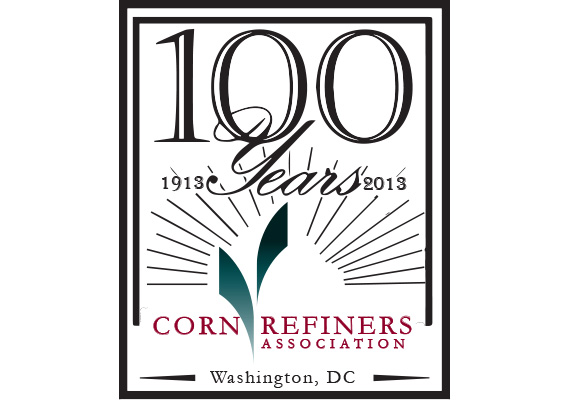
-
COOL Reform Coalition Logo
Manufacturing and agriculture industies formed the COOL Reform Coalition to advocate for U.S. compliance with international trade obligations in a dispute with Canada and Mexico regarding U.S. Mandatory Country of Origin Labeling requirements. The logo I developed utilizes a globe focused on the NAFTA countries where trade would be disrupted. An earlier version of the logo (below) was U.S. focused, but subsequent discussions with the client led to a better informed and representative final logo.